The following and also some other topics in this Statistics part are partly based (e.g. examples) on the book Statistics for Management and Economics by Gerald Keller, Cengage Learning, 10th ed.
We can distinguish between two kinds of Statistics, descriptive vs. inferential statistics.
Descriptive statistics
Methods of organizing, summarizing and presenting data (e.g., arithmetic mean, variance, diagrams).
Inferential statistics
The use of descriptive statistics to learn more about the data (e.g., hypothesis testing).
Population vs. sample
It is important to understand the difference between the notions population and sample.
A population is the group of all items ( ) of interest to a statistics practitioner, e.g.:
- all students at Erasmus University Rotterdam
- all containers to be shipped in the Port of Rotterdam
- all flights departing from New Yourk City
A sample is a set of  data (
 ), usually randomly drawn from a population.
| Population | Sample | Meaning |
 |  | Arithmetic mean |
 |  | Variance |
 |  | Standard deviation |
 |  | Covariance |
 |  | Correlation coefficient |
 |  | Regression coefficients |
| | Number of items |
Population parameters and sample statistics
- A parameter is a descriptive measure of a population, such as the population mean and the population standard deviation. These are constants (if the population does not change);
- A statistic is a descriptive measure of a sample, such as the sample mean and the sample standard deviation. These vary with the selected sample (there are many, many other samples);
- The parameters of a population are usually written in Greek letters. For example the population mean is and the sample mean is ; the population standard deviation is and the sample standard deviation is . See more examples in the following table.
See the difference between the formulas of the population and sample variance.
Population
 |  |  |
 |  |  |
 |  | |
 |  | |
 |  |  |
 |
Sample
|  |  |
| | |
| | |
| | |
 |  |  |
 |
Note the difference between and  in the denominators of the population and sample variances and standard deviations.
Sometimes the notions population and sample are not explicitly mentioned as in the following example.
Example
A police commissioner states that on highway A13 cars drive faster (101.5 km/h) than the admitted maximum speed of 100 km/h.
A local newspaper wants to check whether the commissioner is right and checks at random the speed of 100 cars and finds a mean speed of 99.3 km/h, so it questions the commissioner's conclusion.
Here we have a population mean speed of  km/h, a population size
  very large, a sample size
  cars with a sample mean speed of
  km/h. The question is: is the commissioner right? Later we will explain how to tackle this type of question.
Measures of central location and variability
There are several measures of central location: e.g. arithmetic mean, median, mode.
There are several measures of variability, e.g. variance, standard deviation, range = largest observation - smalles observation.
Frequency diagrams and probability distribution functions
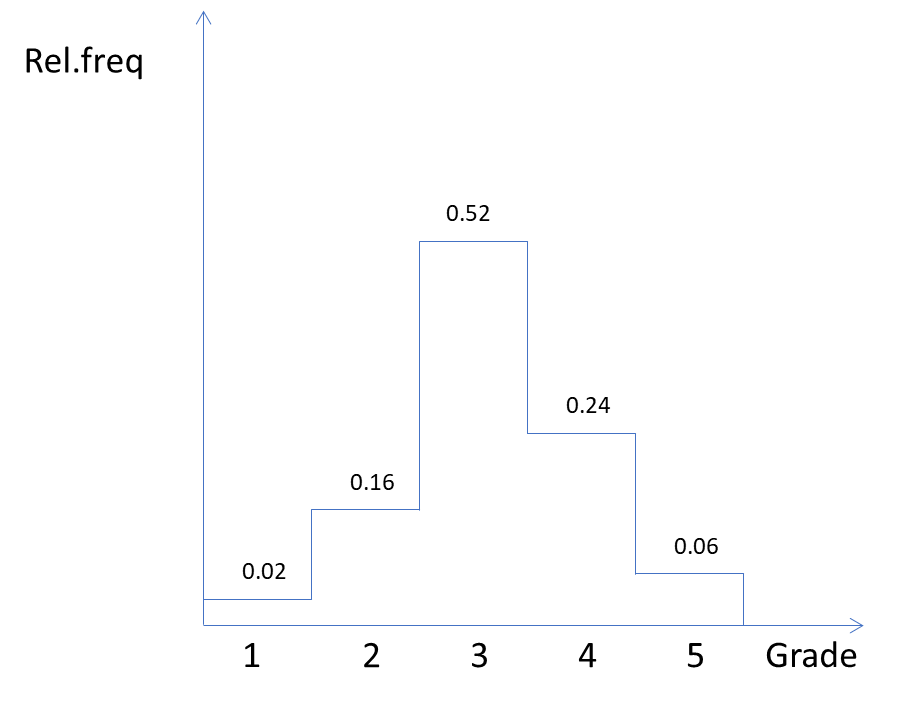
The following table shows the results of an exam taken by 100 students. The grades are 1, ..., 5. Only 2 students got 1 and 6 students got 5 and so on. The second column shows the frequencies  , More important are the relative frequencies: 0.02 or 2% for grade 1.
| Grade | Frequency | Relative freq.  | Cumulative freq.  | Rel. cum. freq. |
 |  |  | | |
|  |  |  |  |
|  |  |  |  |
|  |  |  |  |
|  |  |  |  |
 |  |
The following graph depicts the results in a histogram.
Note that the area between the graph and the horizontal axis equals 1. The graph is a probability distribution function.

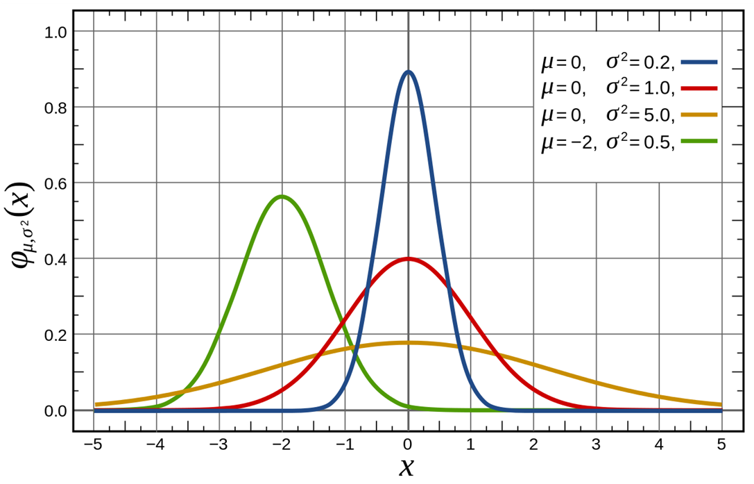
This graph below shows a number of normal distributions with different means and variances. The red one is the graph of a standard normal distribution.
Estimation and confidence interval
In most cases the population mean is unknown and then the sample mean is used to estimate . It is a so-called unbiased estimate of the population mean.
For example, what is the mean height of all Erasmus University students on 1st January 2023, This is a population which is a constant on New Year's day. The population mean certainly exists but is not known and it is practically impossible to determine its exact value.
The estimate is used as an estimate. However, it is just a number and almost always wrong, i.e. different from the real value of . Such an estimate is called a point estimator.
Confidence interval
That is why an interval estimate is more useful in which the unknown lies with some degree of certainty. Such an interval is called a confidence interval. If the probability is 95% that the interval contains such an interval is called a 95% confidence interval. Note, that there is a 5% probability that does not lie in the interval.
If a normally distributed random variable  has an unknown mean and a known (!) standard deviation and the sample taken from this population has size , then the confidence interval is given by the following formula:

If  and thus
  we speak of a
  % confidence interval: the probability is % that this interval contains the population mean . Also, there is a probability of % that the interval does not contain (see Keller, Chapter 10-2a)!
Note that the confidence level  (in this case
  or %) is the proportion of times that an estimating procedure will be correct, and the significance level
  (in this case
  % or %) measures how frequently the conclusion will be wrong in the long run.
We will discuss this formula (especially the meaning of  and ) later.
In the previous formula the population standard deviation was assumed to be known.
If this is not the case (which is true in almost all cases) is estimated by the sample standard deviation and  is replaced by
  (Student′s
  distribution").
Then the formula will be:

As an example, suppose the mean height of a sample of 100 Dutch women is  cm () and the standard deviation
  cm (s), then there is a % probability that the % confidence interval
 ![[169.3;173.1]](https://4mules.nl/wp-content/ql-cache/quicklatex.com-2580f81ff29067e7b861062e7fe1bf3a_l3.png "Rendered by QuickLaTeX.com") contains the population mean (computed by Excel).
contains the population mean (computed by Excel).
Why has to be replaced by  will be explained in later lectures. Then we will also see that
  .
.
Discrete distribution functions
The frequency diagram of grades (discussed previously) shows a discrete probability distribution (i.e. based on a countable random variable). Two important discrete distribution functions are: binomial and Poisson. Here we restrict ourselves to the binomial function.
An example of a binomial problem
Example
On my balcony I have room for  tulips, so I would buy tulip bulbs. However, only
  % of this type of tulip bulb is assumed to grow out.
So, I need to buy more tulip bulbs in order to get the germinated tulips or more I want.
But how many more?
How many tulip bulbs should I buy so that the probability is % or more that eventually tulip bulbs or more will germinate. In later lectures we will explain how to answer such a question. The number of tulip bulbs is a discrete variable.
(Actually, According to Excel we need to buy 102 tulip bulbs or more! Then, still we are not 100% sure that 75 bulbs or more will grow out).
Continuous distribution functions
The normal distribution function is a well-known example of a continuous distribution function (i.e. based on a continuous random variable). Other frequently used continuous distribution functions used later are:
- Standard (
 ) normal distribution;
 - Student’s distribution;
 distribution (chi-squared);
 distribution.
All distributions will be explained and used later.
Hypothesis testing (one population)
Thus far we dealt with descriptive statistics. Now we continue with inferential statistics. An important application of inference is hypothesis testing.
Example
The Dutch brewer Heineken claims that on the average its barrels of beer contain  liters or more, so
  liter. It also states that the population standard deviation is
  liter. Some students are not convinced that Heineken is right, take a sample of 9 barrels and find a sample mean
  liter.
We formulate the so-called null and alternative hypotheses:


Suppose that Heineken is right. What would be the probability that the sample mean is less than  ?
?

This means that the probability that the sample mean of 9 barrels will be less than equals  %, if
%, if  is true. In fact, the formula computes the probability of bad luck: if Heineken is right and you take a sample of
  barrels each day, then only once in approximately years time you will expect to get a sample mean of liters or less.
What will these students conclude?
- They do not reject Heineken's claim: on the average, Heineken's barrels contain liters or more. The fact that the sample mean
 is only a matter of bad luck (this could happen); or
 - They reject Heineken's claim: on the average, Heineken's barrels do not contain liters or more, but less than liters, so
 and that explains why
  .
.
Hypothesis testing (two populations)
Example
Grolsch is another Dutch brewer.
Some students claim that on the average a Grolsch barrel ( ) of beer contains more beer than a Heineken barrel (
 ). Both brewers claim that a barrel of beer contains liters or more. Now we have the hypotheses:


The students want to investigate this claim and use a sample of 9 barrels of Grolsch and 16 barrels of Heineken and find
 liter and
  .|
.|
The population standard deviations are assumed to be known:  liter and
  liter.
Now we have:
 ,
,  ,
, 
 ,
,  ,
, 
Later we will see that there is not enough evidence to reject the null hypothesis at the 5% significance level.
Hypothesis testing (ANOVA)
If we want to compare three or more population means we use ANOVA.
Answering the question whether the population means are equal is done again with hypothesis testing.
The hypotheses are:
: all means are equal : at least one mean is different
Suppose we have 5 populations, then the first idea is to compare the means pair by pair:
{1,2}, {1,3}, {1,4}, {1,5}, {2,3}, {2,4}, {2,5}, {3,4}, {3,5}, {4,5}
and find out whether the population means of all of these pairs may be assumed to be equal.
This method has a great disadvantage (see Keller p. 529).
A better well-known method is ANOVA, meaning ANalysis Of VAriance.
Surprisingly, an analysis of the variances determines whether the subsequent population means may be assumed to be equal. To investigate this we may use Excel.
Hypothesis testing (contingency tables, Chi-squared test
The normal distribution and Student’s t distribution are frequently used, but there are many more important probability distribution functions.
One of them is the  distribution, which is used in e.g. contingency tables.
Example
Many people believe that female students eat healthier food than male students. Is this true?
Answering this question deals again with hypothesis testing.
The null and alternative hypotheses are:
: There is no difference between males and females. In other words: eating healthy and gender are independent;: Eating healthy and gender are not independent.
A worried father wants to investigate this and takes a sample of 120 male and 120 female students (accidentally equal, not necessary). His findings are:
| Healthy | Not healthy | |
| Males |  |  |
| Females | | |
Based on this table, should we reject or not reject the null hypothesis with 95% certainty?
We extend the table.
| Healthy | Not healthy | Totals | |
| Males |  |  |  |
| Females |  |  | |
| Totals |  |  |  |
The first numbers represent the observed values values ( ), those between bracelets are the expected values (
 ),
),  , i.e., the numbers if the null hypothesis would be true.
The test is based on the following formula:

Later we will explain that this result indicates that we do not reject with % certainty: eating healthy and gender are assumed to be independent. The reasoning behind it is the following. If eating healthy and gender would be completely independent (in an extreme case  and thus
  and there would be no random effects, then we would expect
  . The greater will be the more we would expect that both are not independent.
Regression analysis
We first consider a linear univariate regression model. This means that there is only one independent linear variable (and naturally only one dependent variable).
Example
Program managers of MBA programs want to improve the MBA scores of their programs (MBA scores on a scale from to ) and consider the introduction of a GMAT test (Graduate Management Admission Test) (GMAT scores ranging from  to
to  ) as one of the admission criterions.
If there would be an exact linear relation between MBA scores and GMAT scores, the graph of such a relation would be a straight line.
In this case the linear relation would be:

 : the MBA score
 ![(y\in[0, 5])](https://4mules.nl/wp-content/ql-cache/quicklatex.com-71d10e23d01a4d31eb9034bc62776a81_l3.png "Rendered by QuickLaTeX.com")
 : the GMAT score (divided by , so
 ![x\in [2, 8])](https://4mules.nl/wp-content/ql-cache/quicklatex.com-d6d014624f204ded95334c24cb2f5215_l3.png "Rendered by QuickLaTeX.com") .
.
The formula suggests a positive linear relation between the GMAT and MBA score: the higher the GMAT score, the higher the MBA score.
If this model would be correct the MBA score would be exactly 3.32 if the GMAT score would be 600.
On the other hand, if the manager aims to admit only students who will get an MBA score of 4 or more, he should require a GMAT score of exactly 682 or more.
Such an ‘exact’ model without any unexpected disturbances is called a deterministic model: if you know the GMAT score then you could compute the corresponding MBA score exactly. This is not what happens in practice. There are unknown and unforeseen disturbances (such as ‘illness’, ‘worked too hard’, ‘too nervous’, ‘fell in love’, 'luck' et cetera) which make the MBA score to vary. A better model would be:

where ε is a normally distributed random variable with  and a given constant standard deviation
  . Such a model is called a probabilistic model. The graph of such a model would be a so-called scatter plot: not all points lie on the straight line.
In general, the equation of the ‘scatter plot’ is:

where  and
and  are unknown population parameters which have to be estimated using some statistics. If
  and
and  are the estimates of and , respectively, then the regression line (the ‘best’ approximation) is:

What is defined as the ‘best’ and how and are determined and other details will be explained later.
Example
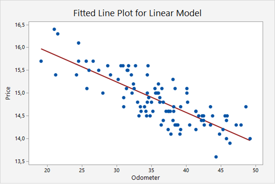
The graph below shows the linear relation between the trade-in values of a basic model of cars and the odometer readings. The scatter plot shows 100 cars. The red line is the regression line (the ‘best’ linear approximation):
 .
.
Multiple regression
Previously we discussed the so-called univariate linear regression: there is just one linear independent variable (GMAT, odometer reading, etc).
But there is more. We also have
- multivariate linear regression (more linear independent variables);
- multivariate regression with interactions and;
- nonlinear regression (one or more nonlinear variables).
Nonparametric statistics
Sometimes the data are ordinal instead of interval. Then it is not possible to compute the means. Yet, we would like to know whether the locations of the populations are equal.
Therefore, instead of testing the difference in population means, we will test characteristics of populations without referring to specific parameters. That is why these methods are called nonparametric statistics.
Nonparametric tests are also used for interval data if the normality requirement necessary to perform the equal-variances t-test of the population means is unsatisfied.
In the following example we want to find out whether the two means are equal.
Example
Sample 1: 22 23 20
Sample 2: 18 27 26
One method to determine whether the means are similar is the Wilcoxon Rank Sum Test. The procedure is as follows. We order all numbers from low to high. The lowest number has rank one.
| Number | 18 | 20 | 22 | 23 | 26 | 27 |
| Rank | 1 | 2 | 3 | 4 | 5 | 6 |
The numbers and ranks are put in the following table and for each sample the ranks are added.  and
and  are the sums of the ranks in the samples. If the samples would have the same ‘mean’, we would expect these sums to be more or less equal. There is a test that decides whether 9 and 12 are close enough to assume the means to be equal. Note that the means are not computed.
| Sample 1 | Rank | Sample 2 | Rank |
| 22 | 3 | 18 | 1 |
| 23 | 4 | 27 | 6 |
| 20 | 2 | 26 | 5 |
 |  |
A population mean is a parameter of that population. Since we do not use the means, we call this method nonparametric.
Time series and forecasting
Consider the following example.
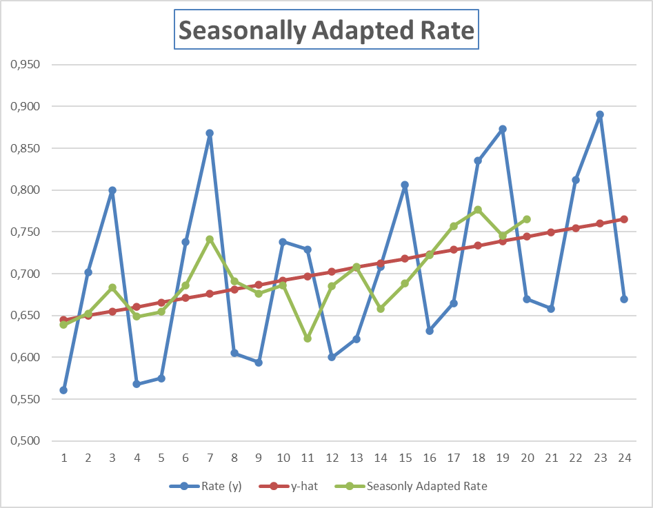
The tourist industry is subject to seasonal variation. In most resorts, the spring and summer seasons are considered the “high” seasons. Fall and winter (except for Christmas and New Year’s Eve) are “low” seasons. A hotel in Bermuda has recorded the occupancy rate for each quarter for the past 5 years. These data are shown below. Based on these data its manager wants to forecast the occupancy rate in the quarters of 2014.
| Year | Rate | Quarter |
| 2009 | 0.561 | 1 |
| 0.702 | 2 | |
| 0.800 | 3 | |
| 0.568 | 4 | |
| 2010 | 0.575 | 1 |
| 0.738 | 2 | |
| 0.868 | 3 | |
| 0.605 | 4 | |
| 2011 | 0.594 | 1 |
| 0.738 | 2 | |
| 0.729 | 3 | |
| 0.600 | 4 | |
| 2012 | 0.622 | 1 |
| 0.708 | 2 | |
| 0.806 | 3 | |
| 0.632 | 4 | |
| 2013 | 0.665 | 1 |
| 0.835 | 2 | |
| 0.873 | 3 | |
| 0.670 | 4 |
In the figure below the blue graph shows the recorded data over the weeks 1-20. The red graph is the regression line based on the recorded data. The green graph shows the seasonally adapted occupation rate (the data without seasonal effects) based on the recorded data. The blue graph between weeks 21-24 shows the forecast based on the recorded data over week 1-20 and the seasonally adapted rate.
How we compute the regression line and the seasonally adapted rate is explained later.